TYPOGRAPHY (TASK 1)
30.03.2021 - 20.04.21 (Week 1 - Week 4)
Haura Laiqa Naznin / 0345050 / Bachelors of Design in Creative Media
Typography
Task 1
INSTRUCTIONS


I digitalized some of the sketches from the previous set, cleaning it up and even improving some of the ideas since I wasn't quite happy with a few of them.


FEEDBACK
REFLECTION
FURTHER READING
Haura Laiqa Naznin / 0345050 / Bachelors of Design in Creative Media
Typography
Task 1
LECTURES
Week 1 (30.03.2021)
During the lecture we were briefed through the module structure, explaining the details about what tasks and projects we will be facing in the future as well as the duration of the course. We were also given a tutorial on how to create our e-portfolios using Blogger. We were told the importance of updating our blog every so often with our work and feedback. Then our first task was explained to us, which was to create a type expression using 4 words chosen from a bigger list of words.
Week 2 (06.04.2021)
All of us were put into groups to give feedback for our sketches of the type expressions. We went in turns showing our sketches whilst the rest did their best to give criticism on how to improve our ideas, or gave compliments if we did it well. After that, we returned to the main session and Mr Vinod taught us a bit about Adobe Illustrator and how to distort the typeface.
Week 3 (13.04.2021)
Firstly Mr. Vinod went through each of our work to give general feedback. Then, we were put into groups to do peer feedback to gain more specific criticism. Further on we were taught how to animate on Illustrator and Photoshop, first by creating frames on Illustrator then uploading them onto Photoshop in order to create it into a gif.
INSTRUCTIONS
<iframe src="https://drive.google.com/drive/folders/1LqQa0zW3DopdwY28bAweWtbh0tl_YqvC?usp=sharing"width="640"height="480"></iframe>
Task 1: Exercises - Type Expression
Our first ever task was to sketch out 4 different words and arrange them into a type expression. I chose the words punch, slice, wave and scream, since they were interesting to play with and gave me the challenge to illustrate them in a way that's simple yet effective. I also attempted to sketch out two other words which were 'eat' and 'spin', but I wasn't sure how to make it look good so they are simply there for experimental purposes.

Figure 1.0 Initial sketches of my chosen words on paper 30.03.2021
Task 2: Digitalizing
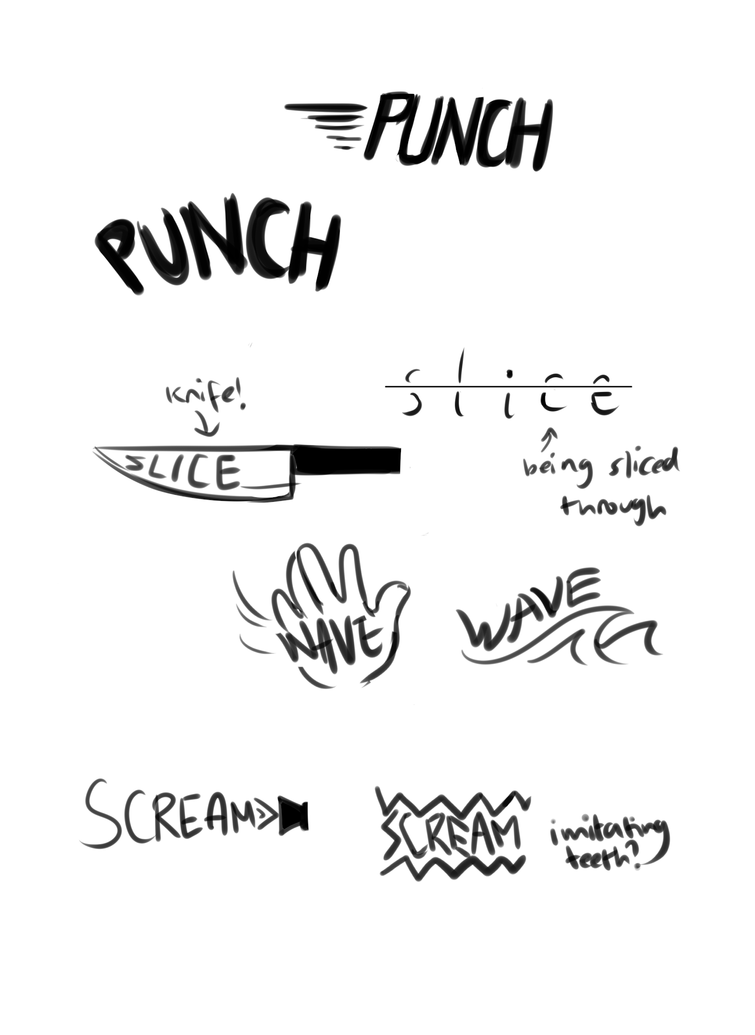
Figure 1.1 Digitalized concept sketches 1.04.21

Figure 1.2 First attempts at using Illustrator 13.04.21
It was really difficult trying to navigate and use Illustrator since I am more familiar with Photoshop's tools, but in the end I managed to get 2 out of 4 words done for this task. Unfortunately I did not get to complete it entirely because I was rushing it a little bit and didn't want to stay up too late trying to finish.

Figure 1.3 Final designs 14.04.21
For the final concepts I decided to only change the word 'punch' since to me, it did not seem dynamic enough. The other two, 'scream' and 'slice' were simple because I didn't want to overcomplicate the designs and have it be too hard to read.
Task 3: Animated gif
Our next task was to create an animated gif for one of our chosen words. I decided to use 'scream' because I thought it would be easy to animate, yet I still struggled with what to do for it.


Figure 1.4 Some frames from the animated gif I will be going to make.
It may not look like much but there are subtle differences between the frames in order to recreate some movement for the text. I wanted to go for something slightly bouncy, even though now I realize I should've made it more sharp.

Figure 1.5
Here I put all the total frames onto Photoshop. I didn't want to add too many in case it would look too crazy or weird, but perhaps that should've been the right choice to make.

Figure 1.6 Final animated gif 15.04.21
FEEDBACK
Week 2: I was told that I needed to explore my ideas more since I only have 2-3 sketches per word. They have also told me some ideas might be hard to pull off with the program we are going to use, since some fonts do not have jagged edges as some of my sketches. Finally, they have pointed out that I could've tried to experiment more with the weight of the letters.
Week 3: My classmates have said that the designs do match the meanings of the words well for the first two that I managed to recreate on Illustrator. They were unsure of the graphical elements that I've put, however said it was simple enough and not too overpowering over the actual word itself. They also liked how I used radial blur on the word 'punch' since it gives it motion, as if it was actually being hit to the center.
Week 4: Mr Vinod says that my animated gif does somewhat give the expression of the word scream, however it is still clearly lacking in impact. He suggested to me to keep the speakers still next time.
REFLECTION
Week 1: Creating an e-portfolio for the first time was a struggle, I have never used the website blogger before but I managed to get the hang of it eventually.
Week 2: Using Illustrator was difficult since there was so many new things to try out and remember. I experimented to see how the tools functioned. It was also fun to sketch out type expression ideas.
Week 3: Animating the type expression was scary to attempt at first, even if my final work for it was simple. I wish I could have done something more extra and interesting.
FURTHER READING


Comments
Post a Comment