DESIGN PRINCIPLES
31.03.2021 - 21.04.21 (Week 1 - Week 4)
Haura Laiqa Naznin / 0345050 / Bachelors of Design in Creative Media
Design Principles
Task
INSTRUCTIONS
However other examples simply show an object bigger than others creating dominance over the other elements.
Week 3 Exercise: Repetition and Movement
For my final idea I decided to use the DDR rhythm game concept since I recently got into those types of games and would like to continue making work based around my interests to keep me invested. I'd like to think it fits the idea of repetition since the arrows are constantly repeated throughout the game. The player in this is supposed to represent me so I drew myself!
FEEDBACK
REFLECTION
Haura Laiqa Naznin / 0345050 / Bachelors of Design in Creative Media
Design Principles
Task
LECTURES
Week 0: Introduction to the module, we were given the information booklet to look through. Then, we began learning about the design principles. There are 4 elements that go into design which are concept, practical, relational and visual elements. I learned that giving color and shading to an object makes it a visual illusion, it gives it a shape which makes it a visual. It exists on a plane which is something new I've learned as well.
Week 1: We continued with learning about Gestalt's theory and contrast, looking at the different examples given to help us with our task. We then learned about visual arrangements - for example, similar objects tend to group together whereas dissimilar objects tend to separate from each other. There were other points such as proximity and repetition.
Week 2: Continuing on we were introduced to the topic of emphasis and balance. Emphasis meaning making one element more prominent than another in a design to create a focal point. Balance is to arrange these elements in an aesthetically pleasing way in order to achieve a look or feel.
Week 3: This week we went through the topics 'repetition' and 'movement'. Mr Charles helped us understand it by showing us an example using the Pied Piper story with the many mice that he managed to make follow him. He used watercolors to illustrate it since that would be the medium we have to use for our week 4 task.
Week 4: We went through the scoring guide for our class which is to check our progress for our work. In it we can score ourselves whenever we begin to do our assignments, a high score meaning we completed it successfully and a low one meaning we did not meet the criteria enough. Further on we then began to explore the topics of unity and harmony which are quite similar in meaning but still rather different.
INSTRUCTIONS
<iframe src="https://drive.google.com/drive/folders/1i_zZn93lb3Ev920s5tsbw3UBnH-wsRIw?usp=sharing"width="640"height="480"></iframe>
Week 1: Contrast and Gestalt Theory
Figure 1.0 First concept sketches
For our first task, we were told to create a design using the idea of contrast. The picture above shows my first 3 ideas that I came up with on the spot, each expanding on the previous idea. I started off with the figure of a woman with long hair, then moved on to remove the hair to simplify the image even further. I didn't want it to be too complicated for my first try. Unfortunately I did not have black and white paper in order to do this so I had to resort to using digital applications.
Figure 1.1 Final idea
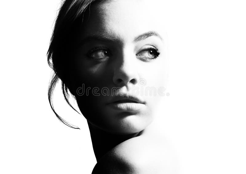
For my final concept I went with the face zoomed up, half of it covered entirely in black to give the illusion of a bright light shining from the right side. I got the inspiration for this from googling black and white contrast images, and this particular image helped me with designing a simple image.
Figure 1.2 Stock image provided by dreamstime.com
Gestalt's theory design
Figure 1.3 "Lost memory" by Tang Yau Hong
Figure 1.4 Pittsburgh Zoo and PPG Aquarium
These two are some examples of designs using Gestalt's theory. I like both because you can see what the two images are formed from both the white and black space. I want to create a simple yet effective image, especially like the first one.
Figure 1.5 First concept
For my first concept I took inspiration from 'Lost memory' and added the face of a man to the right as if he was smoking. I'm sure I got the idea completely wrong and this doesn't count as Gestalt's theory at all but I was genuinely stumped on how to start with the task.
Figure 1.6 2nd concept
For this design I attempted to create the illusion of a butterfly or moth from the faces of two people at the side. I do not know if I managed to get the grasp of the theory better with this but I hope I did.
Figure 1.7 PDF + png final idea
The final concept was inspired by an image of earth that I just happened to come across as I researched different designs on Gestalt's theory. I thought the shapes could help in creating an illusion, so I tried my best to bring that idea to life. It isn't perfect, but I think this best suits the theory by far compared to the other two.
Week 2 Exercise: Balance and Emphasis
Figure 1.8 Balance
Figure 1.9 Sketches
To experiment with the idea of balance I sketched out very basic shapes that follow the idea of 'symmetrical balance'. This is where both sides of the design are mirrored and are essentially the same, although it does not have to be identical, only in color and scale.
Figure 2.0 Asymmetrical balance sketches
These are sketches that explore the asymmetrical balance principle. This type of design is said to bring tension, as if the elements are going to make the entire page tip over since the size and scale are no longer the same. It's less formal than symmetrical but it still gains the viewer's attention.
Figure 2.1 concept sketches
Figure 2.2 even more concepts
Unfortunately I once again don't have the proper materials this week to use for my final design so I will have to do it digitally. I decided to draw out the concepts digitally as well simply for convenience and it's much easier to edit sketches this way too. My ideas are quite literal when it comes to the term 'balance' as shown in the 2nd concept with the skateboarder trying to find his balance, although I like the simplicity. The first one is of a couch with two cats on either side, once again I am trying to illustrate this idea of balance by having them be even despite the posing not being the exact same.
Figure 2.3 Final design
I decided to use the first sketch on the 2nd concept attempts since I liked the idea of it, I wanted something rather simple since it's more my style and what I'm comfortable with. Although in the future I do want to try more complex designs for sure.
Figure 2. 4 Emphasis
Next is the topic of emphasis, which is more interesting to me than balance since more ideas come to mind about it. It is nicer to visualize as well. Most examples show colors popping and standing out from a monochrome background.
Figure 2.5
Figure 2.6
Figure 2.7 concepts
Here are a couple quick sketches for my ideas, which center mostly around bright hair/eye colors that stand out against the ordinary norm of natural hair colors. The first is actually an existing character from an anime who has striking blonde hair compared to everyone else with black or brown hair. He is surrounded by people who shun him for being different.
Figure 2.8 final
Figure 2.9 Sketches for repetition
Repetition means the repeat of certain patterns or movements, so I came up with some ideas and sketches. It's a very straightforward concept really, so most of these are just patterns or elements/characters that are duplicated such as the robot sketch. The idea behind that was of mass produced toys which of course, have a repeated design.
Figure 3.0 Final idea sketched out
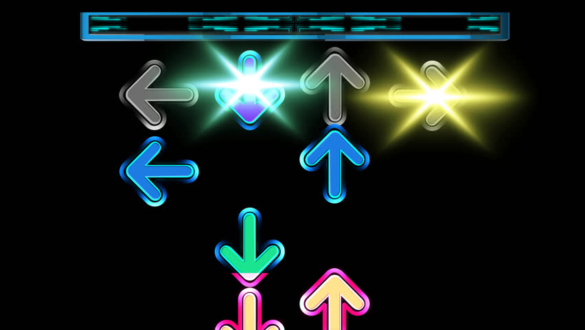
For my final idea I decided to use the DDR rhythm game concept since I recently got into those types of games and would like to continue making work based around my interests to keep me invested. I'd like to think it fits the idea of repetition since the arrows are constantly repeated throughout the game. The player in this is supposed to represent me so I drew myself!
Figure 3.1 Final idea complete
Week 4: Unity and Harmony
Figure 3.2 'Starry Night' by Van Gogh
Figure 3.3 'Four Ice Cream Cones' by Wayne Thiebaud
Figure 3.4 'Moving and Unity' by Rujiman
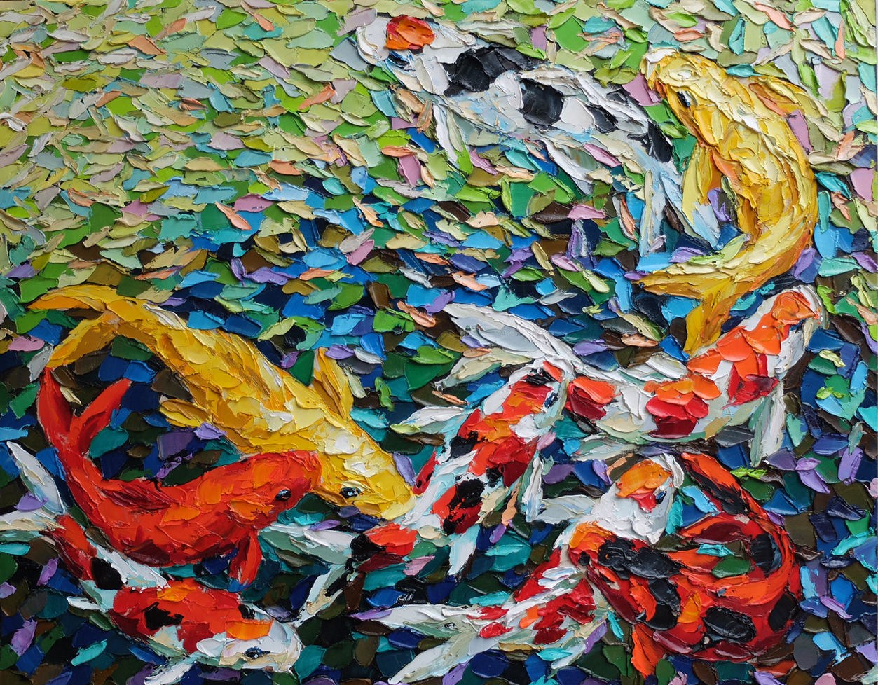
Unity in design means creating a piece of work that feels complete because the colors, texture, repetition and movement work together really well. What I like about these artworks that I have chosen is the colors and texture, theyre all bright and vibrant which is what I lean towards more in terms of color palettes. The texture creates such an interesting visual, something that is out of the norm of using regular smooth brushstrokes. It's very appealing to my eyes.
Figure 3.5 Sketch for 'Unity'
I was very inspired by the painting of the koi fish in particular and wanted to draw them myself for my final piece. I then thought to add flowers, just to make it more interesting, hoping the colors would come together to make the whole piece unify.
Figure 3.6 Progress using watercolor
Figure 3.7 Final artwork
FEEDBACK
Week 1: Mr Charles has said that I completed both of the designs for Contrast and Gestalt theory successfully. He didn't see too many issues with it. He has said that most of us understood these principles well.
Week 2: The sketch for balance is better compared to the final, Mr Charles stated that the texture on it was nice since the final seemed too smooth for his liking. If I could change it, I would simply use more textures again. As for the emphasis he had no problem with it too.
Week 3: Mr Charles liked my idea for repetition since it could also combine movement. To improve on my final work I should add more arrows overlapping over each other and not to overdo the use of colors. In addition to that, I shouldn't have added the character since it really has nothing to do with the topic itself.
Week 4: He saw no issues with both of my submissions. They fit with the themes fine enough, although for the harmony piece he suggested to me to remove the tree in the corner.
REFLECTION
Week 1: It was very difficult to try and attempt Gestalt's theory more than contrast since it required more brainpower to create a design that is like an illusion, yet it was fun to experiment with.
Week 2: Surprisingly found it tricky to find a design I liked for balance, although for emphasis I simply wanted to indulge in my interests and create work around it. Still wished I had the right materials for these assignments.
Week 3: Finally, I had watercolors so now I could properly attempt the task, even if I wasn't entirely happy with the result. It was a journey to figure out how the watercolors worked again after not using it for a while. The idea itself I was unsure if the teacher would like but I went for it anyway.











Comments
Post a Comment