ADVANCED TYPOGRAPHY: TASK 1
23.08.2021 - 20.09.21 (Week 1 - 5)
Haura Laiqa Naznin / 0345050 / Bachelors of Design in Creative Media
Advanced Typography
Task 1
INSTRUCTIONS


Haura Laiqa Naznin / 0345050 / Bachelors of Design in Creative Media
Advanced Typography
Task 1
LECTURES
Week 1: Typographic Systems (23.08.2021)
In the first week we simply went through the briefing of what advanced typography will be all about for the following weeks.
Week 2:
This week we only went through the previous week's exercises which were to attempt recreating the typographic systems in our own way. Mr Vinod gave each of us feedback in order to improve them for next week.
Week 3:
Continuing on from last week we looked through each other's typographic systems and Mr Vinod gave general feedback as well as specific feedback to most of the class. Afterwards we were briefed about what our next task would be which was to create a letterform out of a picture of our choice.
Continuing on from last week we looked through each other's typographic systems and Mr Vinod gave general feedback as well as specific feedback to most of the class. Afterwards we were briefed about what our next task would be which was to create a letterform out of a picture of our choice.
Week 4:
We submitted our traced and cleaned up letterforms from whatever pictures we have chosen and were given feedback about it. Then, Mr Vinod asked some students to give each other feedback rather than have him do it, with the help of Mr Razali. Mr Vinod showed us a demo on how he would have created a typeface from a chosen picture.
Week 5:
We go through this week's submissions which was Type & Play: Type and Image. Mr Vinod gave most of us specific feedback as well as general ones. He then briefed us about the next task to do with Key Artworks.
INSTRUCTIONS
Task 1: Exercises - Typographic Systems
We were tasked to explore the typographic systems by attempting to recreate it ourselves on InDesign. By watching Mr. Vinod's lecture video about it, we can see how we could try to make our own designs using these systems.


Figure 1.0 Attempts at the different systems
It was certainly a challenge to attempt recreating it since I haven't used InDesign in a while. The practice was good though and I learnt a lot of new tricks, such as how to put text around a circle.
Figure 1.2 Final PDF of all the systems
Figure 1.3 Systems with grids shown
Part 2: Type & Play
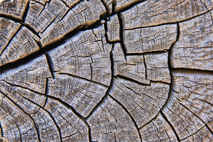
For the next task we were told to find letterforms within pictures of nature or anything that we can find around us, a very close up shot is needed however. We have to find 4 letters or numbers and trace them, later on refining them and continuing to do so until it looks just like a typeface.
Figure 1.4 Photos of close up cracked glass and wood
These two images are what I'll use to find the letterforms. I decided to take extract from both of them to compare which letters or numbers looked better to me and wouldn't take too long to refine, since I don't have all the time in the world to keep perfecting them.


Figure 1.5 Extracted letterforms


Figure 1.6 Clearer images of the extractions
I ultimately decided to use the letters from the cracked glass since I liked how sharp they looked and it was rather easy to read compared to the other. The letters are more obvious. Although the other is more interesting since it has gaps.

Figure 1.7 Comparison with Futura Std
I went with Futura as a base to go off on for my refining process since I thought the shapes looked most similar to it.

Figure 1.8 Cleaned up letterforms
Mr Vinod gave feedback that my typeface did not really have the essence of the original image, although not necessary, the thick and thin lines of the original image were lost and became too uniform which I had to bring back.

Figure 1.9 Tracing again


Immediately, I had the idea to create something related to water. The ripples of water are interesting to me and they look beautiful in nature, so I went to find several pictures of bodies of water that I may use.


Figure 2.3 Images of the ocean
I then thought to use pictures of the ocean that I could potentially use instead of the rivers.

Figure 2.4 First attempt at adding typography, minimal editing
I used the font 'Bodoni std' for the word and put the effect layer 'overlay' to create the illusion that it belongs in the environment. However, it clearly still looks flat and unbelievable, so I knew I had to choose a picture that showed more water ripples.


Figure 2.5 Second attempt using a different image
This has a better texture to it that I can edit my word to match with. For now I tested out what the same effects would have done to the word, changing the opacity slightly to get it just right.

Figure 2.6 Transforming using 'Warp'

Figure 2.7 Final.jpg
I ended up changing the effect layers to make it match against the lake even more, adding slight highlights here and there where the ripples were also highlighted.
Figure 2.8 Final.pdf


Comments
Post a Comment