ADVANCED TYPOGRAPHY: TASK 2
04.10.2021 - 18.10.2021 (Week 1 - 9)
Haura Laiqa Naznin / 0345050 / Bachelors of Design in Creative Media
Advanced Typography
Task 2
INSTRUCTIONS


At first, I didn't fully understand how I should go about when designing the poster, but after the lecture I now understand where I went wrong. I had to use the key artwork in a unique way, not just slapping it on the front like I did there, to be the actual artwork of the poster. I had to make it appealing of course but not too complex. It could be done by using a small part of the key artwork and repeating the pattern all over etc.


Now it was time to make the collaterals. I decided to go for a badge, enamel pin and tote bag, since those would match what a candy store would sell the most. I went onto google to find mockups of these products and edited the key artworks onto them.
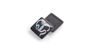

As for the enamel pin, I made it from scratch myself, using the effects that Photoshop offered to give it the metallic indented look like what enamel pins have.


I then compiled all of the images to create a flat lay, displaying all the products and poster.


Haura Laiqa Naznin / 0345050 / Bachelors of Design in Creative Media
Advanced Typography
Task 2
LECTURES
Week 1: Typographic Systems (23.08.2021)
In the first week we simply went through the briefing of what advanced typography will be all about for the following weeks.
Week 2:
This week we only went through the previous week's exercises which were to attempt recreating the typographic systems in our own way. Mr Vinod gave each of us feedback in order to improve them for next week.
Week 3:
Continuing on from last week we looked through each other's typographic systems and Mr Vinod gave general feedback as well as specific feedback to most of the class. Afterwards we were briefed about what our next task would be which was to create a letterform out of a picture of our choice.
Continuing on from last week we looked through each other's typographic systems and Mr Vinod gave general feedback as well as specific feedback to most of the class. Afterwards we were briefed about what our next task would be which was to create a letterform out of a picture of our choice.
Week 4:
We submitted our traced and cleaned up letterforms from whatever pictures we have chosen and were given feedback about it. Then, Mr Vinod asked some students to give each other feedback rather than have him do it, with the help of Mr Razali. Mr Vinod showed us a demo on how he would have created a typeface from a chosen picture.
Week 5:
We go through this week's submissions which was Type & Play: Type and Image. Mr Vinod gave most of us specific feedback as well as general ones. He then briefed us about the next task to do with Key Artworks.
Week 6:
We showed our progression with our Key Artworks and he gave us pointers on how we could change it up to make it better.
INSTRUCTIONS
Task 2A: Key Artwork
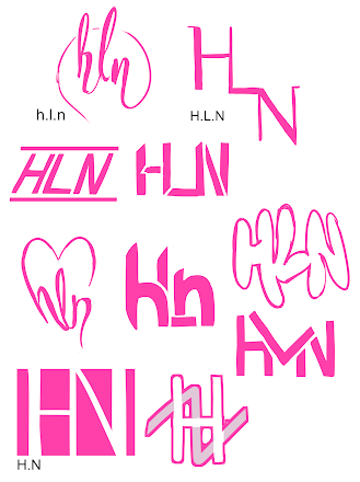
For our next task, we had to come up with a key artwork using our initials that could represent some sort of business. Mr Vinod suggested we go for a career that we would've chosen if we didn't become designers. I made several potential sketches with my initials H.L.N.

Figure 1.0 Initial sketches
After looking at it all I decided to use the heart shaped one, because I liked that design best out of the bunch. I then attempted to recreate it.

Figure 1.1 First attempt
The design of it was altered slightly, instead of having thick and thin lines I thought it looked better if it was the same in thickness for a clean look. However, Mr Vinod said after I showed it that it was too thin.

Figure 1.2 First attempt at poster

Figure 1.3 Improved key artwork
Afterwards I redid my poster knowing now what I had to do for it. I changed what the business from a bakery to a candy store instead, thinking that it fit the style of my key artwork better. The colors have been altered greatly to match the vibe of candies as I used more bright and saturated colors.
Figure 1.4 Final poster
Figure 1.5 Badge mock-up
Figure 1.6 Enamel pin
Figure 1.7 Effects used for the enamel pin + a close up to see it better
Figure 1.8 Tote bag
Figure 1.9 Mockup of poster
This is a mockup of the poster as if it was hung inside the shop itself.
Figure 2.0 Flat lay
Figure 2.1 Animating the invite
Figure 2.2 Final animated invite


Comments
Post a Comment