ADVANCED TYPOGRAPHY: TASK 3
18.10.2021 - (Week 9 - 13)
Haura Laiqa Naznin / 0345050 / Bachelors of Design in Creative Media
Advanced Typography
Task 3
INSTRUCTIONS
Haura Laiqa Naznin / 0345050 / Bachelors of Design in Creative Media
Advanced Typography
Task 3
LECTURES
Week 1: Typographic Systems (23.08.2021)
In the first week we simply went through the briefing of what advanced typography will be all about for the following weeks.
Week 2:
This week we only went through the previous week's exercises which were to attempt recreating the typographic systems in our own way. Mr. Vinod gave each of us feedback in order to improve them for next week.
Week 3:
Continuing on from last week we looked through each other's typographic systems and Mr Vinod gave general feedback as well as specific feedback to most of the class. Afterwards we were briefed about what our next task would be which was to create a letterform out of a picture of our choice.
Continuing on from last week we looked through each other's typographic systems and Mr Vinod gave general feedback as well as specific feedback to most of the class. Afterwards we were briefed about what our next task would be which was to create a letterform out of a picture of our choice.
Week 4:
We submitted our traced and cleaned up letterforms from whatever pictures we have chosen and were given feedback about it. Then, Mr. Vinod asked some students to give each other feedback rather than have him do it, with the help of Mr. Razali. Mr. Vinod showed us a demo on how he would have created a typeface from a chosen picture.
Week 5:
We go through this week's submissions which was Type & Play: Type and Image. Mr Vinod gave most of us specific feedback as well as general ones. He then briefed us about the next task to do with Key Artworks.
Week 6:
We showed our progression with our Key Artworks and he gave us pointers on how we could change it up to make it better.
INSTRUCTIONS
Task 3:


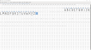


Figure 1.0 Initial sketching
Figure 1.1 Sketching on paper using different markers
Figure 1.2 Full alphabet digitalized sketch
Using my knowledge of how fonts in comic books look, this is what I came up with as a starting point. It's not refined but it's the basic idea of what I'm hoping to achieve.
Figure 1.3 Rough clean up
I just realized that I had not made the letter 'Y' so I quickly created one as I was working on refining the typeface. It still does not look perfect whatsoever, but it's better than any attempt I've made previously. I then decided to import it to FontForge to test how it would look if I typed some words out.
Figure 1.4 Importing to FontForge
Figure 1.5 Testing the font in FontForge
Figure 1.6 More testing
Again, the typeface is far from perfect unfortunately. The kerning needs a lot more work as well as the letters themselves that need editing since some look awkward next to each other.
Figure 1.7 Testing typeface in speech bubbles
Figure 1.8 More speech
Unfortunately I forgot to actually create exclamation marks and periods since I was so focused on trying to finish perfecting the letters, even if the final product doesn't look as polished as I hoped. It was still a good learning experience though.


Comments
Post a Comment