INFORMATION DESIGN
03.01.2022 - 06.03.2022
Haura Laiqa Naznin / 0345050 / Bachelors of Design in Creative Media
Information Design
Task 1
INSTRUCTIONS


This is the final outcome. It isn't perfect but I am proud of it!


Haura Laiqa Naznin / 0345050 / Bachelors of Design in Creative Media
Information Design
Task 1
LECTURES
Week 1:
We were briefed on what this module was going to be about and it had everything to do with infographics as well as the different types of infographics. Like in intercultural design, we had to work in groups and our final was to create an animated infographic about a topic that they gave us.
Week 2:
We learned further more about the different styles of infographics and then Mr. Martin taught us how to make kinetic typography.
Week 3:
We watched informational videos about FLIP 3 topic provided by the other groups to get us started. Then, Ms. Anis just told us to continue working on our Pasta Grannies exercise, which we had to compile information about any recipe we'd like. For Mr. Martin's lesson, he taught us how to make motion graphics of charts and graphs.
Week 4:
No classes, except on Thursday due to Chinese New Years. In that one class we had we learned about the FLIP 4 topic which was about Manuel Lima's 9 Directives Manifesto. Afterwards, Mr Martin taught us about vector character animations.
Week 5:
In our lecture session we watched the presentations about Manuel Lima's 9 Directive Manifesto. Afterwards, we were mostly left to our own devices to complete our projects and such. With Mr. Martin, we watched several animatics of our sketches for our final project.
Week 6:
Not many lectures with Ms. Anis, just with Mr. Martin to do with checking up on our progress with our final projects. Other than that, we were just finishing off other work on our own.
Week 7:
Again, no lectures as we were left to our own devices. We had a meeting with Mr. Martin again about our progress.
INSTRUCTIONS
Task 1: Organizing items
Our first exercise was to organize a group of items into different categories of our choice. The items were also whatever we wanted it to be. I chose to do a set of Ohuhu markers.
Figure 1.0 Ohuhu markers laid out on paper
Initially I wanted to display them in an interesting way, but realized that was too much work and it may have been too complicated to put information on. I then went for something much more simpler so it was easy to digest and look at the information.
Figure 1.1 New layout
Putting it in a straight order like this reduced the amount of paper I used as well as it looking better for the eyes to take in the information. I only really had two categories for them which was the color and number of marker. I did also add the names of each marker.
Figure 1.2 Final layout
I realize the text was far too small and light so I went on to edit it digitally to make it bolder.
Figure 1.3 Edited final
I also increased the contrast to see the colors better. I do think the text should have definitely been bigger, I underestimated how small it would look on photos.
Exercise 2: Improve an infographic
Our next exercise was to find a bad infographic online and improve it using whatever tool we desired. I went onto google for my search and found this one.
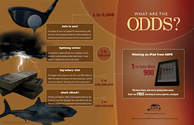
Figure 1.4 Badly designed infographic
The reason why I chose this was because the colors and pictures were downright horrendous. Why was it so dark? Why was the color scheme so boring and not pretty to look at? Everything just seemed sad honestly, not pleasing to the eyes at all.
For my redesign, I used Photoshop to edit it all together.
Figure 1.5 Screenshot of my work in Photoshop
I chose a much lighter and friendlier color scheme because for an infographic about this fun fact it would fit better than something dark as the original.
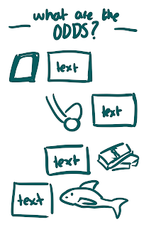
Figure 1.6 Initial sketches
Figure 1.7 Final outcome
Motion Graphics Exercise
Mr. Martin gave us the task to create kinetic typography using a song of our own choice. We initially did a demo with him with a song by Pink.
Here is the part I did for my group, the song chosen was Uptown Funk by Bruno Mars.
Figure 1.8 My part for the music video
This is the final outcome with all our parts together.
Figure 1.9 Final music video
We then moved on to learn about animating graphs for statistics. The slides he provided us gave us information on how to animate bar charts, pie charts, and line graphs.
Figure 2.0 First part of the pie chart animation
Figure 2.2 Second part of the animation
Mr. Martin then gave us the task to make an animation based off information that he provided in the slides. I had to create a pie chart animation of Covid 19 cases by age in India.
Figure 2.2 Final animation
Project 1
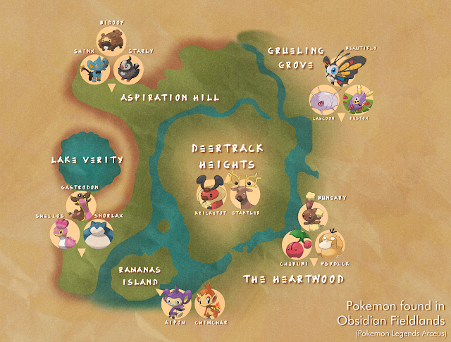
For our first project we had to create an infographic poster using the L.A.T.C.H method of displaying information. We could illustrate any type of info we wanted and I decided to use pokemon, specifically pokemon you find in the game 'Pokemon Legends Arceus'.
My main goal was to make it easy to understand at first glance and to use very simple drawings (Except for the pokemon since drawing them each would take too much time.) I also tried to find a font that fit the vibe of the game which is set in the past and has a lot of Japanese style influence with the architecture and fashion. So, I found a typeface that fit that theme whilst also being readable, because an infographic needs to be understood!
Figure 2.3 First draft
I put it all together once I redrew the in-game map. There is still information missing such as what area this is exactly and some minor edits to make it more old and crinkly, like a worn out map.
Figure 2.4 Final poster
I decided not to put a title but just a short summary of what the information is supposed to convey in the corner.
Project 2: Pasta Grannie's Infographic Poster + Motion graphic
For our 2nd project we had to choose a granny from the Youtube channel named 'Pasta Grannies' that, as the title suggests, makes videos about different pasta recipes.
I tried to look for one that wasn't more than 5-6 minutes long and decided on the 'hot chili spiced 'nduja pasta' recipe. It was short and easy to understand all the steps, so chonking the information did not take too long!
Figure 2.5 Sketch of poster
This is my first initial sketch for the poster. I then went on to draw out the different assets for it, such as the ingredients and tools.
Figure 2.6 All the pictures I drew by hand
The final poster design changed quite a bit compared to the first sketch and was heavily inspired by other recipe infographics I saw online. I really tried to keep it cohesive and simple, remembering from one of Lima's directives which was not to overload it with complex designs and that simplicity really can be the best.
Figure 2.7 Final poster
Animated Motion
Figure 2.8 Final animated video


Comments
Post a Comment