GAME ART
31.08.2022 - 05.12.2022
Haura Laiqa Naznin / 0345050 / Bachelors of Design in Creative Media
Game Art
INSTRUCTIONS
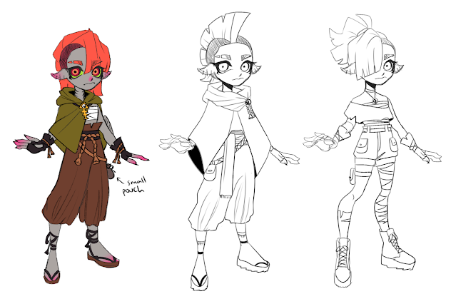
These were the very first concepts that I had in mind for my chosen game. They were for a DLC that took place in a different region and were supposed to reflect the fashion choices of said region. This would be changed later on though as I continued development.
Haura Laiqa Naznin / 0345050 / Bachelors of Design in Creative Media
Game Art
LECTURES
Week 1: Public Holiday
Week 2: We were given a basic introduction to the module, then we were briefed on what sort of exercises we were meant to do. It's a class that goes hand in hand with environment design as well, since we chose a game that we liked to focus on.
Week 3: Each of us proposed our ideas for what game we wanted to use to base our character designs on. For our character designs, we had to create 3 different archetypes (hero, villain, minion etc) as well as give them personalities and a reason why they may be in the game.
Week 4: Feedback was given about our concept sketches. Weapons and props were suggested for us to try out and design.
Week 5: Class cancelled.
Week 6: Further feedback was given to us based on what sketches we showed to Mr. Kannan. Afterwards, we had a lecture about silhouettes and how important they are to a characters initial design.
Week 7-8: No class and independent learning week.
Week 9: After being given feedback regarding our progress, Mr. Kannan moved on to discuss what to do for our next steps. He talked about the UI design for these characters and the game they were set in, as well as the animation seen in-game. Movement such as the idle animation or attacking motion, it was all to give ideas for the poses we can draw our characters in. Props such as weapons or things to carry in-game were also discussed.
Week 10-14: From this week onward, we continued to work on our projects and exercises with feedback given along the way. Mr. Kannan also continued to direct us and reminded us of the workflow that concept art went through. Not only that, but helping us to push ourselves with creativity and understand what sort of style we should use that matches the game we chose or what our skill level was.
INSTRUCTIONS
EXERCISES / PROJECT 1
These were the very first concepts that I had in mind for my chosen game. They were for a DLC that took place in a different region and were supposed to reflect the fashion choices of said region. This would be changed later on though as I continued development.
After gaining feedback from Mr. Kannan, I went ahead and further developed the initial ideas into more concrete designs. I knew by this time that I wanted to create a protagonist and 2 villains, with one of the bad guys being an orca. This would soon be changed though.
I wanted the protag to have a more desert-type of clothing and from googling inspiration, there were a lot of cloaks and cloth overlaying on top of each other. The pants were baggy as well, and although it wasn't necessary, I wanted to keep that aspect in. As for the orca villain, he was quite difficult to draw at first since it would be one of my first time drawing an anthropomorphic character. I had to use existing characters within the game as reference which only helped slightly. It wasn't until I came across artwork by fans depicting their own marine life fan characters for the game that I created a style more suitable for it. I exaggerated the torso, making him quite round and giving him a seemingly friendly face despite being a villain. At this point I wasn't sure what I'd do for the second villain other than have her be female.
Figure 1.1 Development of the characters
After further feedback, the orca villain was then changed to be a shark. I had already finalized the protagonist by this point and then I started working on the second villain, who I decided to base off of garden eels as it gave me inspiration to make her hair medusa-like. She was going to match in style with the shark, so I went with the left outfit design.
Figure 1.2 Colour palettes and facial expressions
I already knew what colours I wanted for them - the shark would have cooler colours whilst the lady would have more warmer colours to contrast him. They ended up having the stereotypical colors corresponding to their gender, but I find it not too much of an issue since they themselves aren't going to fall into those stereotypes of being overly masculine or overly feminine.
Figure 1.3 Final turnarounds
After their designs and colours were finalized, the turnaround would soon be complete. Now, I had to create splash art for each of them, as well as a poster since I am unable to 3D model with the time limitation we had.
Figure 1.4 Final Splash Art


Comments
Post a Comment